
Tech Logo Trends: Analysis of 2,000+ Brands (and 128 Top Performers)
Research last updated: July 2025
We manually reviewed more than 2,000 logos and analyzed a curated sample of 128 leading SaaS brands. This research helps you understand which design patterns to follow if you want to align with successful tech companies that spend tens or even hundreds of thousands of dollars on branding agencies. No AI was used in conducting this research.
We've analyzed both well-established and new companies in different industries (design, marketing, development, analytics, HR, etc.) including companies like MailChimp, Basecamp, Asana, Intercom, Hotjar, Wistia, BitBucket, etc. All of the logos in the analysis are manually curated to have professional and well-designed logos in the first place.
Logo structure
72% of logos use icon + text


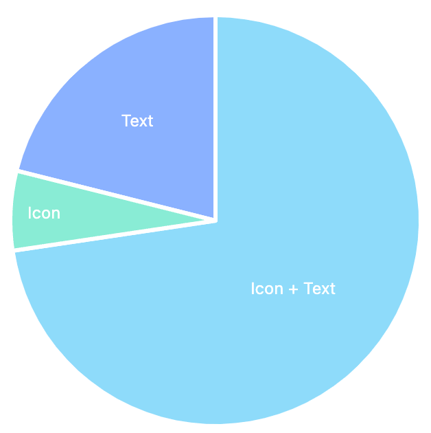
21% use text only and 6% icon only. So the standard structure for Saas logos is an icon with text to the right. Some choose to simplify it and leave text only, a design move that is very popular among DTC brands (most of them have a text-only logos).
30% of logos with icons use the first letter of their name in the icon


These logos typically use the first letter as the icon with a stylistic twist.
67% of icons go beyond the basic shapes


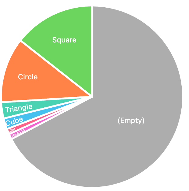
Out of all logos using an icon 67% use graphically complex themes (e.g. arrows, waves) while the rest 33% of the Saas companies use basic shapes like square, circle, triangle etc.
Typography
93% of logos use Sans-Serif fonts



Most logos unsurprisingly go with Sans-Serif font-families. While Serif, Serif-Slab, Script fonts are very common in DTC brands, in Tech logos design they are very rare.
Assuming you're not a professional designer, here is a short overview of font styles:
- Serif fonts are distinguished by the small lines on the ends of the letters. This is a classic style of type that works well for logos. Serif fonts tend to be more legible than their sans-serif counterparts and often used as body text to optimize the reading experience (that's why you see them used in newspapers). Serif fonts look more sophisticated and luxurious which often makes them the preferred choice when designing logos for healthcare and financial services companies.
- Sans-Serif - the more modern, sans-serif typefaces are distinguished by their lack of small lines on the ends of the letters. Sans-serif convey a feeling of simplicity and minimalism as opposed to Serif fonts.
- Slab is a hybrid of the serif and sans-serif typefaces. It's the good middle ground between the two. Slab typefaces are legible like serif fonts, but they also possess the boldness of a sans-serif font. This makes slab fonts a very versatile typeface. You can use it to design logos for just about any industry.
All-lowercase name (42%) is almost equally popular as normal case (48%) followed by all-uppercase (10%)


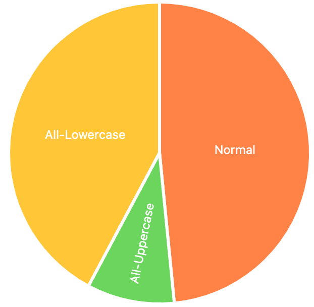
Switching from all-uppercase to regular or all-lowercase brand name is a trend from the last several years. Big companies like Walmart, Staples, AT&T, Target ditch all-uppercase. Brands like Mastercard, Fisher Price switch from regular to all-lowercase. Seems like similar trends are relevant in the tech industry.
Names consisting of two words never have a space in between
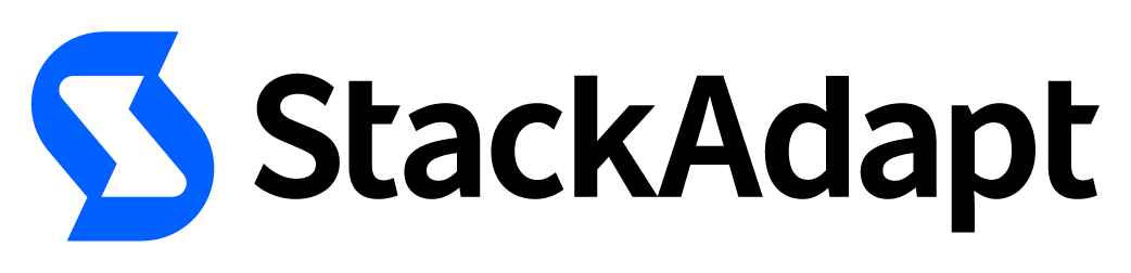


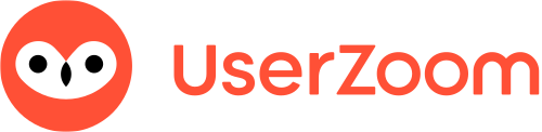
30% of the companies we looked at had a two-worded name. Every single company with a two-word name chose not to split the words in their logos (e.g. NetSpring and not Net Spring). This is different from consumer brands which prefer to separate words (e.g. Fresh Sends).
Colors
51% of the logos are black




This is another difference from the consumer brands that are more likely to use colors in their logo design as opposed to tech companies.
When brands do go with colors, the most popular colors are: blue (18%), orange (10%), green (8%).
If you're not a designer, blue is often associated with trust, loyalty, and wisdom and can be a good choice for companies that want to create a sense of stability and reliability. Since startups want to establish a trustworthy identity, it makes sense that it's the most popular color used by Saas companies.
Every project starts free. See designer-made logos built from these patterns.